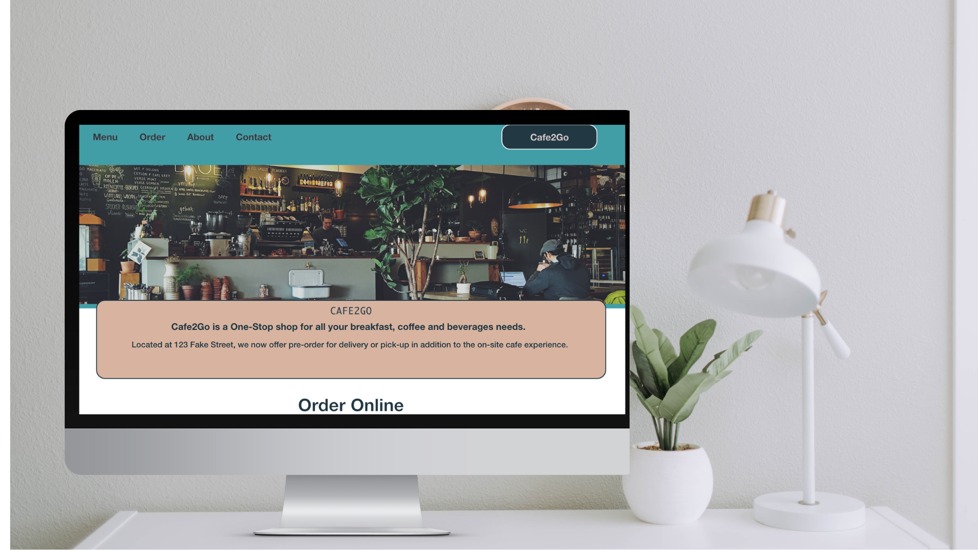
This Case Study is an ongoing project during my Coursera & Google UX Design certificate. As I make improvements and updates, this post will be updated with further reasoning and details.
This is part of my 2nd course through Coursera and my first with Google, which was an interesting combination that also allowed me to formalize a lot of what I have been working on and within for the past few years for both websites and mobile.
This UX design course was focused on the full scope of the user experience design; process from fundamentals to finish. This allowed me to ideate a concept, conduct user research, create brand guidelines for the app, lo-fi wireframes, hi-fi wireframes and prototypes that showed app functionality in the lo-fi instance and hi-fi instance – this time for a web page instead of a mobile app.

This course used a combination of tools and practices, which allowed my final result to be presentation-ready. The tools that I recommend specifically are:
- AdobeXD
- Google Sheets
- Canva
- Coolors.co
- FontJoy
- Google Slides
- Unsplash
Thanks for stopping by – more details forthcoming! For questions, please visit my contact page and reach out!
Google-UX-Design-Certificate-Cafe2Go-Web-Case-study-slide-deck-BW
